
Joshua Stewart's Blog
Tuesday, July 21, 2015
Well I am always trying out new things and learning new techniques and ways to improve my craft. Here is another animation, Pencil Test, of a balloon in flight.
Here is a similar animation but I was going for an Alien Orb exploring the suburbs. The alien orb is more mechanical than the balloon. I attempted to show the organic nature of the balloon flying on the wind while the Alien Orb is meant to seem more mechanical and intelligently controlled. let me know if you feel it works.
Thursday, May 7, 2015
WOW... I need to post more

 Wow, I'm not being good about posting here. I will try to remember to get on this and post more than once a year.
I have two images included in the Academy of Art Spring show this year. one image in the Illustration portion of the show and one image in the concept art portion of it. I am honored that I got some images in with all of the amazing artists at the school. There were over 2500 submissions this year. If you happen to be at the school, check it out and let me know how it is, I'm not going to be able to get to the show this time.
Wow, I'm not being good about posting here. I will try to remember to get on this and post more than once a year.
I have two images included in the Academy of Art Spring show this year. one image in the Illustration portion of the show and one image in the concept art portion of it. I am honored that I got some images in with all of the amazing artists at the school. There were over 2500 submissions this year. If you happen to be at the school, check it out and let me know how it is, I'm not going to be able to get to the show this time.
Wednesday, April 16, 2014


Saturday, February 1, 2014


Saturday, December 7, 2013
small paint over for one of my friends in Character development class. I tweaked her feet and shadow shape on the floor is all…Simona Ceccarelli designed and painted this character, she is a great artist you should check her stuff out here is a link. Simona Ceccarelli


Saturday, November 16, 2013


Wednesday, October 2, 2013
Long time no posts
Sorry to whoever might be following my blog, It has been a long time since I posted anything and usually its some sort of critique for the game I'm developing or a critique for one of my Masters classes.
So here is one of the images I have recently created for fun. I made it for my new website website isn't up yet but I should have it going soon. I'll let you know when i do have it up and ready for the public.
Well anyway here is some art.

So here is one of the images I have recently created for fun. I made it for my new website website isn't up yet but I should have it going soon. I'll let you know when i do have it up and ready for the public.
Well anyway here is some art.

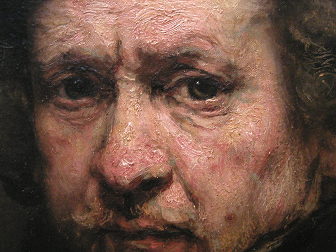
Vermeer's Lady standing at a virginal and Rembrandt's Prodigal Son

Vermeer over all uses more color, he seems to be lighter and airy with his value and color choices, and if we look at a page filled with Rembrandt's painting overall we have dark backgrounds with the figures emerging from the darkness bathed in light. Vermeer has a wider range of paintings, from images similar in value to Rembrandt where there is a dark background and the figures are bathed in light again. To images where the figures are dark almost silhouetted and the background is light, and images like Lady Standing at a virginal where the value scheme of the entire painting is lighter.
Rembrandt seems to have more of a limited color pallet, but that might be due to his use of a monochromatic value under painting and color washes.
Both Vermeer and Rembrandt are successful in narration, conveying the location and mood of each of the subjects painted.
Vermeer seems to paint more his subjects looking at the viewer rather than Rembrandt who only seems to do this with Portraits, this is a useful tool for Vermeer, it helps engage the viewer more than a strait forward narrative would, with all subjects interactive with one another and not drawing the viewer in by including them with a figures outwards gaze.
Both Artists Portraits are different in style; Vermeer paints more narrative portraits Example Lady standing at a virginal, Lady sitting at a virginal, Lady playing at a virginal, these are portraits of women not necessarily commissioned portraits, but are also narrative.
While Rembrandt seems to have more of a strait forward approach to portraiture where the figure is emerging from a dark background with a good sense of light and dramatic colors, but are not interactive with the environment so much as just documenting the portrait of the subject.
Rembrandt seems to use more visible brush strokes and Vermeer is overall more polished and smooth.


If we compare Rembrandt’s Prodigal son painting with Vermeer’s Lady Standing at a virginal we will see many of the differences I already stated. The differences in overall color and paint application, Rembrandt is much more textural in his paint application. We will also see some differences in the approach of the artists when it comes to story telling and composition.
Rembrandt uses the rule of thirds to great effect in his Prodigal son Painting, the key focal point in his image is in the top left third of the image. While Vermeer has a central focal point located almost perfectly in the middle of the canvas. Vermeer does use the rule of thirds some in Lady standing by a virginal because he has the eyes of the figure in line with the top third of the painting, which adds to the viewers interest more so that if the figure’s face was perfectly centered in the middle of the painting.
The background of Lady Standing is much more refined and developed compared to the Prodigal son, by Rembrandt. This could be due to the message and story the artists are attempting to convey. In the Prodigal son, Rembrandt is focused on the interactions of the figures reunion and the emotions and feeling of each character. While Vermeer is telling us a story about his painting by the location of the woman, her clothing and the overall feel of the environment.
In the Prodigal son painting, Rembrandt leads the viewer around the painting by utilizing his strong focal point and character interactions. The viewer is drawn first to look at the father and son’s reunion, due to the high contrast and emotion felt by the viewer because of the long awaited return of the son by the father. The viewer’s eye is then drawn down the light value mass of the son and is lead across the image by the perspective of the floor plane. The eye is then drawn up to the other son and we see and feel his emotions at his brother’s return. His gaze returns us to the father and son. The viewer continues to bounce around the image looking at each of the background figures in turn, always returning to the focal point by following the gaze of each of the servants, always coming back to the father and son focal point.

Vermeer, not having multiple figures in his image uses the background elements to similar effect in his Lady Standing by a Virginal image. His focal point is the woman in the center of the image; the viewer’s eye is drawn outwards towards the different background elements but always returning to the woman. Vermeer’s visual device is more relaxed in my opinion. With easy sweeping of the eyes over the image, with our eye meandering out to the blue chair in the foreground, getting blocked from leaving the image by the back of the chair, which leads our eye up to the virginal and back to the woman. Then our eye continuing up to the painting, following the edge of the paintings over to the light of the windows, and following the light of the windows back to the woman in the center of the image again.
Both Visual methods used by the artists are successful they are just different approaches to help convey the meaning and mood of the painting by the artist to the viewer.
Monday, September 9, 2013

Wednesday, February 27, 2013

On this image, My teacher actually was making a point with some of the non-objective abstract paintings created during the modernist movement.
the bottom image is actually by Pollock while the top image is actually a photograph of my teachers painting overalls.
this is very funny because it made a great point, you can argue the superiority of any non objective painting because it is completely subjective to the viewers interpretation.
No one in the class realized that the top painting wan't by Pollock. and these were highly educated Master Level students.
This proves to me that without rules, and without an idea of what good art is. we are left with crap art.
We need a standard of excellence, we need critiques and to learn what good art is...
Fine art is Dead.
Long live the Artisan (aka Art with a Purpose and level of skill, excellence and effort)
Monday, December 31, 2012
A Fool's Fortune Card game
After what felt like forever........
A FOOLS FORTUNE game is released to the public! ...(art by me, aka Joshua J Stewart)
http://boardgamegeek.com/boardgame/133671/a-fools-fortune


 here are a few images from the game, I started working on it in 2011 and finished the card art up around march, then I revised until around june....so its taken a while to get published. Sadly due to a few miscommunications between myself and the publisher, I didn't do the cover or the graphic design, just the card art. even though I would have loved to do everything. but oh well, the cards look great anyway. So everyone, please buy a copy of it. so it will do very well and they will hire me again! HA! if you do I will even sign the art if see me.
A FOOLS FORTUNE game is released to the public! ...(art by me, aka Joshua J Stewart)
http://boardgamegeek.com/boardgame/133671/a-fools-fortune


Friday, December 21, 2012


Wednesday, December 19, 2012

Wednesday, December 5, 2012


Wednesday, November 28, 2012

the 3d model for the Game turned out a little different from what I originally drew up for the concepts, but thats how it goes sometimes, the 3d model in the game looks closer to the character I'm doing for this card.
Monday, November 19, 2012


Tuesday, November 13, 2012

Friday, November 2, 2012

Wednesday, October 31, 2012

Sunday, October 28, 2012

Friday, October 26, 2012

-Josh
Thursday, June 28, 2012
Spec Work AKA Work for free
Hey check out this video, it is so true with most creative jobs, including illustration. "Hey do this and you'll get more work from it!... and it will be good for your portfolio!....you'll get your name out there.... and I don't have to pay!"
Thursday, June 21, 2012
Kick Starter!
http://www.kickstarter.com/projects/visionsofzosimos/visions-of-zosimos-the-worlds-first-true-mmoccg
Check out the kickStarter we are working on for our game. please check it out. Feel free to pledge! :) its a great project and a one of a kind game.
Stay tuned for my upcoming Kickstarter GRAPHIC NOVEL with Author Steve Savile,
http://www.stevensavile.com/wordpress/
It will be EPIC!
http://www.kickstarter.com/projects/visionsofzosimos/visions-of-zosimos-the-worlds-first-true-mmoccg
Hey everyone check this video out. this is the teaser trailer for the video game that I have been doing a lot of concept art, and Card art for. We hope to have the game finished by the end of the year but Ill let you all know when it is launched and really going. go ahead and let me know what you think.
Hey everyone check this video out. this is the teaser trailer for the video game that I have been doing a lot of concept art, and Card art for. We hope to have the game finished by the end of the year but Ill let you all know when it is launched and really going. go ahead and let me know what you think.
Sunday, June 26, 2011
hey everyone,
I was contacted with a rush cover and spot illustration job early this week.
I had to paint a cover and 4 interior illustrations over-night which I feel was quite a feat! it was crazy and i didn't sleep from Monday morning (when I got the call) to Tuesday night (when I got the finished images to the magazine) ...but I got it done. check it out! this is Philadelphia weeklys digital version of the magazine. let me know what you think of my illustrations. (I did the cover and the illustrations for the cover story)
also check out
http://www.philadelphiaweekly.com/archives/Issue-590-124343339.html
this is there web site for Philadelphia Weekly, they used a couple of the images I painted on the website that they didn't use in the magazine.
Thursday, February 24, 2011

WOW! it has been a long time since I have posted anything. sorry about that. but... anyway..
I have been very busy lately. here is an image I have recently done for Reogrande Games, it is called Peddler- a traveling merchant. it is for the card game Dominion. I am also still working on the on-line card game by Foreverinteractive, that is due to launch by the summer.
also I am working on a new card game for Reogrande games called "A Fools Fortune" it has 77 card images a game box and rule book illustrations. they want it done quick too so I have been swamped... Ill post some images from that game when I get the ok from them.
Take it easy everyone.
-Josh
Monday, July 12, 2010
7deadlysins Gallery show.
I entered the 7 deadly sins art competition a while ago, while I didn't win the grand prize I was included in the gallery show with a bunch of other artist.
the competition included illustrators, fine-artist, graphic designers, and sculptors from around the word with artists entering the show from more than 70 countries
here is the address to the main page of the competition.
http://www.7sinscontest.com/news.php
Hundreds of artists submitted and not everyone could be included in the show, but I was on the 7 sins contest website and saw a photos of the first gallery show, and one of the photos on the home page had my image in the background being looked at by one of the gallery patrons.

This was very exiting for me to see my art in the gallery and on the photo page of the 7sins web site! this is very good exposure for an aspiring illustrator...like me :)
The first exhibition arising from the 7sins international contest has been a success, both critical and audience ways. For ten days the exhibition has been held in one of the best areas of the city of Santa Cruz de Tenerife, artists from more than 70 countries submitted art to the show, and the show will go to many cities and countries around the word..
This is the image the gallery patron was looking at in the photo on 7sins contest....

I had one more image entered in the show it is below

Each image had my name on it so hopefully I got some good exposure
Jonathan Fesmire MFA project
hey Everyone, the past month or so I have been working with my friend Jon Fesmire helping him with his MFA project, I have been doing concept images and sketches for the characters, environments and story Jon came up with.
this is a link to youtube where Jon is going to be posting his video logs and step by step progress of his Masters project. Jon's project is to render 3D models in a realistic way so he can eventually get hired on with a great movie studio doing the same thing for Movies! You know the kind, like Hellboy or Iron man, where you have a character in the movie that looks real but never existed, Half the monsters in Hellboy 2 are done in the same way Jon's project is.
Jon's Project is a fun one, with undead Zombie like gunslingers, a genius mechanical inventor/Saloon Madam with a giant robot, and a Steam punk Coyote. Real fun stuff for an artist like me to draw and paint.
here is the link to Jon's Master thesis blog where he tells more about his project
http://jf-mastersthesis.blogspot.com/
and here is the address to Jon's Diviant Art site where he puts all the drawings for his project.
http://jfesmire.deviantart.com/#/d2qw2z8
Please check it out, it would be worth it
Monday, May 24, 2010

Hey! I did this image for a competition, the Left Hand Of God, Poster contest,(at dontpanic.uk) the winner of the competition would get their image used with the promotion of Penguin's new Book the book Left Hand of God, and get some sweet money and books..ect... the contest was one of those contests where the public votes on their favorite, and I was the last person to upload. so I didn't get any votes (sad day) because I was too late. and the Voting didn't continue past the deadline. how stupid is that? well anyway I got a good image out of it. and I like to tell my self I would have won if the voting lasted longer.
Subscribe to:
Comments (Atom)