

Joshua Stewart's Blog
Wednesday, January 20, 2016
Saturday, November 14, 2015

Thursday, November 12, 2015
Refining the character from the Silhouette shape
After picking a shape, I start doing a rough drawing over the top, not finished, not really detailed but giving enough information to let the client or Art Director know what your going for, like these..


 with this example I took 3 of the silhouettes and added some drawing over the top of each of them. I lowered the opacity and printed them off on copy paper, and drew directly onto the print. this part of the process could be done in photoshop or other program as well. but I like the feel of pencil on paper so I do this when not in a big hurry.
Bellow are screen grabs of refining and adding together different ideas.
with this example I took 3 of the silhouettes and added some drawing over the top of each of them. I lowered the opacity and printed them off on copy paper, and drew directly onto the print. this part of the process could be done in photoshop or other program as well. but I like the feel of pencil on paper so I do this when not in a big hurry.
Bellow are screen grabs of refining and adding together different ideas.


 After showing them again, you'll be asked to combine ideas usually. Take #4's head and put it on the torso of #8 with the feet of #6… just for an example. if your lucky you will get to keep one of the ideas in tact if not its still fun to combine the concepts. I begin to refine them even more at this stage. adding them together in photoshop, and depending on the art director possibly submitting more example of how thing combine differently. like this example from Codename:Demon.
 After seeing the ideas it was decided that they were cool, but not quite as GREAT as it could be. So I went throughout the process again and came up with a new version all together.
which turned into this. The idea behind the Codename:Demon character is the monster hides behind a human form. they then transform into a monstrous version, or opposite.


which turned into this. The idea behind the Codename:Demon character is the monster hides behind a human form. they then transform into a monstrous version, or opposite.

This is a very refined photoshop painting, with some references of the egg sack on her back and an example of one of the props. From here it is easy to throw over a bunch of rough colors. Color studies.


after picking a color I go into refined finish painting using Color layers, Multiply, and Overlay in photoshop.
The finished looks something like this.

adding notes to explain some ideas is a good idea.
I'll explain about props some next.
Character Design Silhouette Shapes
Here we go this is the first post about some of my process and how I go about working out different aspects of my art,
the first step in my character design process.
we start off with rough silhouette shapes, focusing on overall shape and having a rough idea of where I want the character to go in the end.


 I usually start off with a sketch book and a Sharpie marker, work out some ideas fast not worrying too much about the small details. those will come latter.
From there I take them into Photoshop. It is also an option to use a tracer light box or tracing paper to refine the ideas.
I usually start off with a sketch book and a Sharpie marker, work out some ideas fast not worrying too much about the small details. those will come latter.
From there I take them into Photoshop. It is also an option to use a tracer light box or tracing paper to refine the ideas.  So I took my favorites and refined them some filled them in and added a few areas that could be fine details.
I showed them to a few people (fellow artists or art director) and got some feedback. these below are based on the feedback received. I have the originals above and the revisions below in this next image… so you can see the changes.
So I took my favorites and refined them some filled them in and added a few areas that could be fine details.
I showed them to a few people (fellow artists or art director) and got some feedback. these below are based on the feedback received. I have the originals above and the revisions below in this next image… so you can see the changes.
 At this point you usually turn them in again to show the art director or client, depending on what they want.
When a silhouette is picked I move forward with that direction.
As a good side note, I strongly suggest you never turn in anything you don't love or would like to see finished. It has been my experience, if I ever turn in a design or sketch I didn't like that would be the sketch chosen every time. so Make sure you like what your making and never submit something you hate.
I'll post the next step in for the characters next.
At this point you usually turn them in again to show the art director or client, depending on what they want.
When a silhouette is picked I move forward with that direction.
As a good side note, I strongly suggest you never turn in anything you don't love or would like to see finished. It has been my experience, if I ever turn in a design or sketch I didn't like that would be the sketch chosen every time. so Make sure you like what your making and never submit something you hate.
I'll post the next step in for the characters next.


Thursday, September 24, 2015
 Here are some cat shapes I threw together for a discussion in one of my classes this week.
I agree there are a lot of ways to explore characters with poses that have foreshortening and a lot going on within the overall shape of the character, and silhouettes do not work for that. However, that kind of illustration is not what silhouettes are meant to be used for. Silhouettes are supposed to be the first step done when you have no idea or a limited idea of what the final character will look like. or a very limited direction (orc, mutant, alien) these are the times when silhouettes work the best. For example, one of my fellow students, appears to already have a clear direction of how he wants his characters to be. His Alice character is a slim female character with a floor-lenght fitted dress that flares at the bottom. the cat is a standard house cat shape, but no need to work out a lot of silhouette shapes for that. he knows what they are going to be already. This image above would be the kind of explorations he should be doing if he wanted to explore his cat character further.
we might have ideas of what aspects we would like the character to have but the silhouette sketches will hopefully help us push concepts to the next level. then once we have a solid grasp of what the character will be based on the silhouette studies. then we can place the character in an interesting foreshortened pose that wouldn't make a good silhouette but will make a wonderful finished illustration. silhouettes are a tool and only work if they are used for the right purpose and in the right context…. like concept art.
Here are some cat shapes I threw together for a discussion in one of my classes this week.
I agree there are a lot of ways to explore characters with poses that have foreshortening and a lot going on within the overall shape of the character, and silhouettes do not work for that. However, that kind of illustration is not what silhouettes are meant to be used for. Silhouettes are supposed to be the first step done when you have no idea or a limited idea of what the final character will look like. or a very limited direction (orc, mutant, alien) these are the times when silhouettes work the best. For example, one of my fellow students, appears to already have a clear direction of how he wants his characters to be. His Alice character is a slim female character with a floor-lenght fitted dress that flares at the bottom. the cat is a standard house cat shape, but no need to work out a lot of silhouette shapes for that. he knows what they are going to be already. This image above would be the kind of explorations he should be doing if he wanted to explore his cat character further.
we might have ideas of what aspects we would like the character to have but the silhouette sketches will hopefully help us push concepts to the next level. then once we have a solid grasp of what the character will be based on the silhouette studies. then we can place the character in an interesting foreshortened pose that wouldn't make a good silhouette but will make a wonderful finished illustration. silhouettes are a tool and only work if they are used for the right purpose and in the right context…. like concept art.
Tuesday, July 21, 2015
Well I am always trying out new things and learning new techniques and ways to improve my craft. Here is another animation, Pencil Test, of a balloon in flight.
Here is a similar animation but I was going for an Alien Orb exploring the suburbs. The alien orb is more mechanical than the balloon. I attempted to show the organic nature of the balloon flying on the wind while the Alien Orb is meant to seem more mechanical and intelligently controlled. let me know if you feel it works.
Thursday, May 7, 2015
WOW... I need to post more

 Wow, I'm not being good about posting here. I will try to remember to get on this and post more than once a year.
I have two images included in the Academy of Art Spring show this year. one image in the Illustration portion of the show and one image in the concept art portion of it. I am honored that I got some images in with all of the amazing artists at the school. There were over 2500 submissions this year. If you happen to be at the school, check it out and let me know how it is, I'm not going to be able to get to the show this time.
Wow, I'm not being good about posting here. I will try to remember to get on this and post more than once a year.
I have two images included in the Academy of Art Spring show this year. one image in the Illustration portion of the show and one image in the concept art portion of it. I am honored that I got some images in with all of the amazing artists at the school. There were over 2500 submissions this year. If you happen to be at the school, check it out and let me know how it is, I'm not going to be able to get to the show this time.
Wednesday, April 16, 2014


Saturday, February 1, 2014


Saturday, December 7, 2013
small paint over for one of my friends in Character development class. I tweaked her feet and shadow shape on the floor is all…Simona Ceccarelli designed and painted this character, she is a great artist you should check her stuff out here is a link. Simona Ceccarelli


Saturday, November 16, 2013


Wednesday, October 2, 2013
Long time no posts
Sorry to whoever might be following my blog, It has been a long time since I posted anything and usually its some sort of critique for the game I'm developing or a critique for one of my Masters classes.
So here is one of the images I have recently created for fun. I made it for my new website website isn't up yet but I should have it going soon. I'll let you know when i do have it up and ready for the public.
Well anyway here is some art.

So here is one of the images I have recently created for fun. I made it for my new website website isn't up yet but I should have it going soon. I'll let you know when i do have it up and ready for the public.
Well anyway here is some art.

Vermeer's Lady standing at a virginal and Rembrandt's Prodigal Son

Vermeer over all uses more color, he seems to be lighter and airy with his value and color choices, and if we look at a page filled with Rembrandt's painting overall we have dark backgrounds with the figures emerging from the darkness bathed in light. Vermeer has a wider range of paintings, from images similar in value to Rembrandt where there is a dark background and the figures are bathed in light again. To images where the figures are dark almost silhouetted and the background is light, and images like Lady Standing at a virginal where the value scheme of the entire painting is lighter.
Rembrandt seems to have more of a limited color pallet, but that might be due to his use of a monochromatic value under painting and color washes.
Both Vermeer and Rembrandt are successful in narration, conveying the location and mood of each of the subjects painted.
Vermeer seems to paint more his subjects looking at the viewer rather than Rembrandt who only seems to do this with Portraits, this is a useful tool for Vermeer, it helps engage the viewer more than a strait forward narrative would, with all subjects interactive with one another and not drawing the viewer in by including them with a figures outwards gaze.
Both Artists Portraits are different in style; Vermeer paints more narrative portraits Example Lady standing at a virginal, Lady sitting at a virginal, Lady playing at a virginal, these are portraits of women not necessarily commissioned portraits, but are also narrative.
While Rembrandt seems to have more of a strait forward approach to portraiture where the figure is emerging from a dark background with a good sense of light and dramatic colors, but are not interactive with the environment so much as just documenting the portrait of the subject.
Rembrandt seems to use more visible brush strokes and Vermeer is overall more polished and smooth.
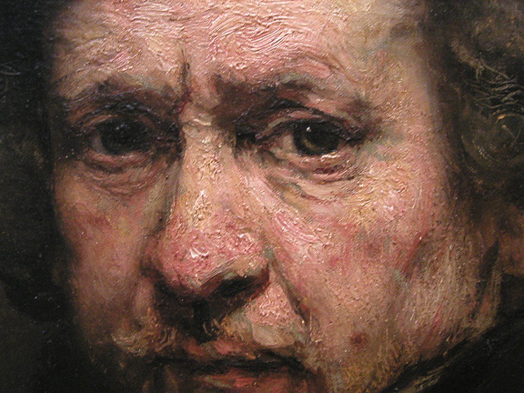

If we compare Rembrandt’s Prodigal son painting with Vermeer’s Lady Standing at a virginal we will see many of the differences I already stated. The differences in overall color and paint application, Rembrandt is much more textural in his paint application. We will also see some differences in the approach of the artists when it comes to story telling and composition.
Rembrandt uses the rule of thirds to great effect in his Prodigal son Painting, the key focal point in his image is in the top left third of the image. While Vermeer has a central focal point located almost perfectly in the middle of the canvas. Vermeer does use the rule of thirds some in Lady standing by a virginal because he has the eyes of the figure in line with the top third of the painting, which adds to the viewers interest more so that if the figure’s face was perfectly centered in the middle of the painting.
The background of Lady Standing is much more refined and developed compared to the Prodigal son, by Rembrandt. This could be due to the message and story the artists are attempting to convey. In the Prodigal son, Rembrandt is focused on the interactions of the figures reunion and the emotions and feeling of each character. While Vermeer is telling us a story about his painting by the location of the woman, her clothing and the overall feel of the environment.
In the Prodigal son painting, Rembrandt leads the viewer around the painting by utilizing his strong focal point and character interactions. The viewer is drawn first to look at the father and son’s reunion, due to the high contrast and emotion felt by the viewer because of the long awaited return of the son by the father. The viewer’s eye is then drawn down the light value mass of the son and is lead across the image by the perspective of the floor plane. The eye is then drawn up to the other son and we see and feel his emotions at his brother’s return. His gaze returns us to the father and son. The viewer continues to bounce around the image looking at each of the background figures in turn, always returning to the focal point by following the gaze of each of the servants, always coming back to the father and son focal point.

Vermeer, not having multiple figures in his image uses the background elements to similar effect in his Lady Standing by a Virginal image. His focal point is the woman in the center of the image; the viewer’s eye is drawn outwards towards the different background elements but always returning to the woman. Vermeer’s visual device is more relaxed in my opinion. With easy sweeping of the eyes over the image, with our eye meandering out to the blue chair in the foreground, getting blocked from leaving the image by the back of the chair, which leads our eye up to the virginal and back to the woman. Then our eye continuing up to the painting, following the edge of the paintings over to the light of the windows, and following the light of the windows back to the woman in the center of the image again.
Both Visual methods used by the artists are successful they are just different approaches to help convey the meaning and mood of the painting by the artist to the viewer.
Monday, September 9, 2013

Wednesday, February 27, 2013

On this image, My teacher actually was making a point with some of the non-objective abstract paintings created during the modernist movement.
the bottom image is actually by Pollock while the top image is actually a photograph of my teachers painting overalls.
this is very funny because it made a great point, you can argue the superiority of any non objective painting because it is completely subjective to the viewers interpretation.
No one in the class realized that the top painting wan't by Pollock. and these were highly educated Master Level students.
This proves to me that without rules, and without an idea of what good art is. we are left with crap art.
We need a standard of excellence, we need critiques and to learn what good art is...
Fine art is Dead.
Long live the Artisan (aka Art with a Purpose and level of skill, excellence and effort)
Monday, December 31, 2012
A Fool's Fortune Card game
After what felt like forever........
A FOOLS FORTUNE game is released to the public! ...(art by me, aka Joshua J Stewart)
http://boardgamegeek.com/boardgame/133671/a-fools-fortune


 here are a few images from the game, I started working on it in 2011 and finished the card art up around march, then I revised until around june....so its taken a while to get published. Sadly due to a few miscommunications between myself and the publisher, I didn't do the cover or the graphic design, just the card art. even though I would have loved to do everything. but oh well, the cards look great anyway. So everyone, please buy a copy of it. so it will do very well and they will hire me again! HA! if you do I will even sign the art if see me.
A FOOLS FORTUNE game is released to the public! ...(art by me, aka Joshua J Stewart)
http://boardgamegeek.com/boardgame/133671/a-fools-fortune


Friday, December 21, 2012


Wednesday, December 19, 2012

Wednesday, December 5, 2012


Wednesday, November 28, 2012

the 3d model for the Game turned out a little different from what I originally drew up for the concepts, but thats how it goes sometimes, the 3d model in the game looks closer to the character I'm doing for this card.
Monday, November 19, 2012


Tuesday, November 13, 2012

Subscribe to:
Posts (Atom)